Malmberg
UX Optimizations
The starting point for this project was a, by Malmberg compiled, list of issues that occurred mostly on the mobile version of their website. The biggest challenge was creating a workflow as efficient and effective as possible within the limited time and budget.
My activities involved setting up a Design Library, optimizing UX designs and recommending future improvements / way of working.
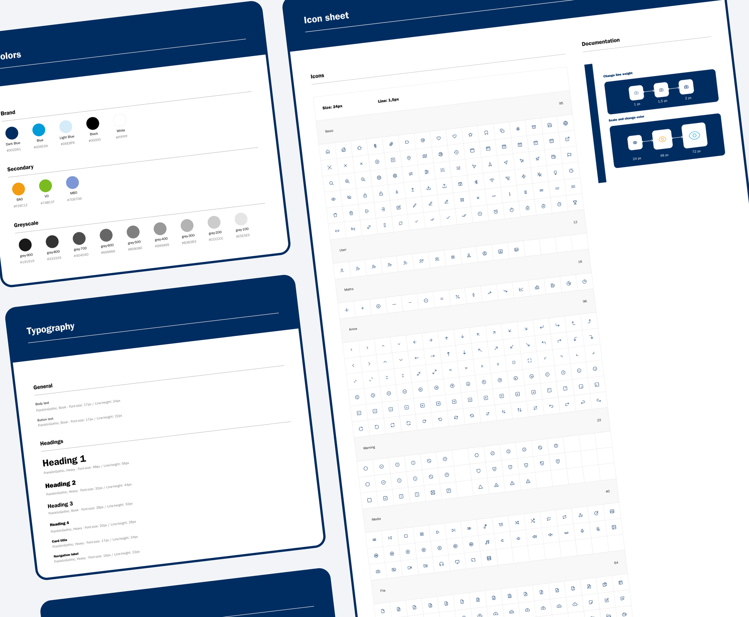
As a starting point, a Style Library containing typography, colors, an icon set, grids and logo usage was set up. In addition, elements like buttons, dropdown items and navigation items were also added to this file. This Style Library served as a the building blocks for (re)designing components and pages (templates), ensuring consistency throughout all the designs.
The Design Library will eventually be used as the basis for a much more extensive Design System.
Design Library
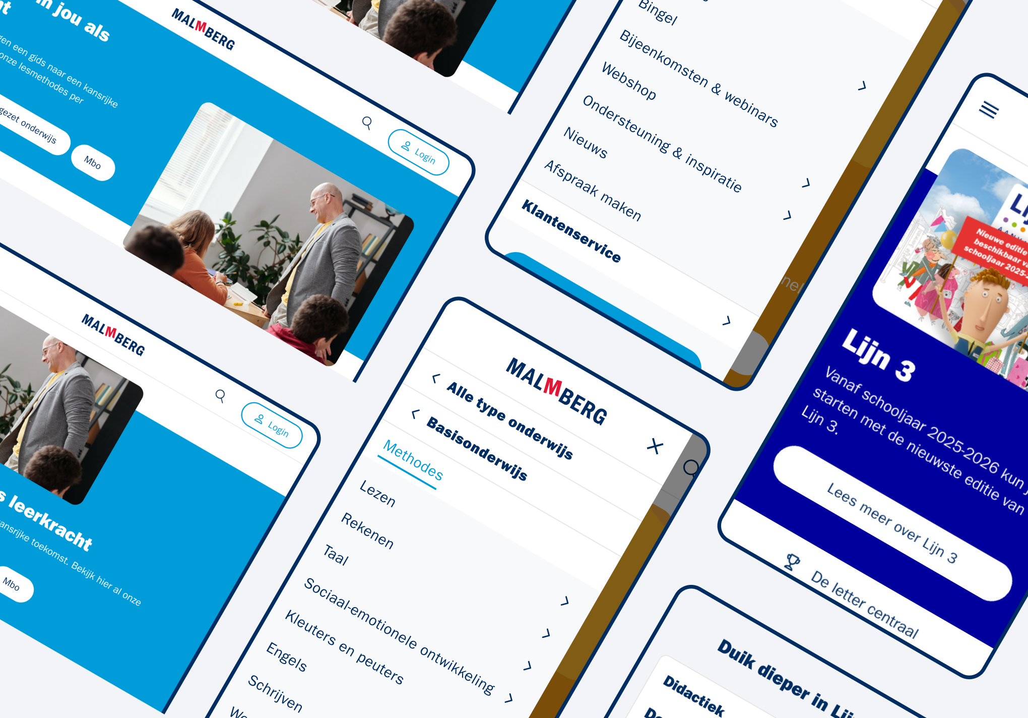
The main issue regarding the Hero component is visible on mobile due to styling. The large heading in combination with a lot of padding on the text boxes, result in the text spreading across multiple pages. As an effect, the user has to scroll down a couple of pages before noticing the button(s).
The optimization uses a smaller heading, less padding and a more concise and to the point introduction text, nudging the reader to the CTA’s. Adding to that, the optimization uses a hero image that includes the target audience namely, teachers.
Quick win #1: Hero component

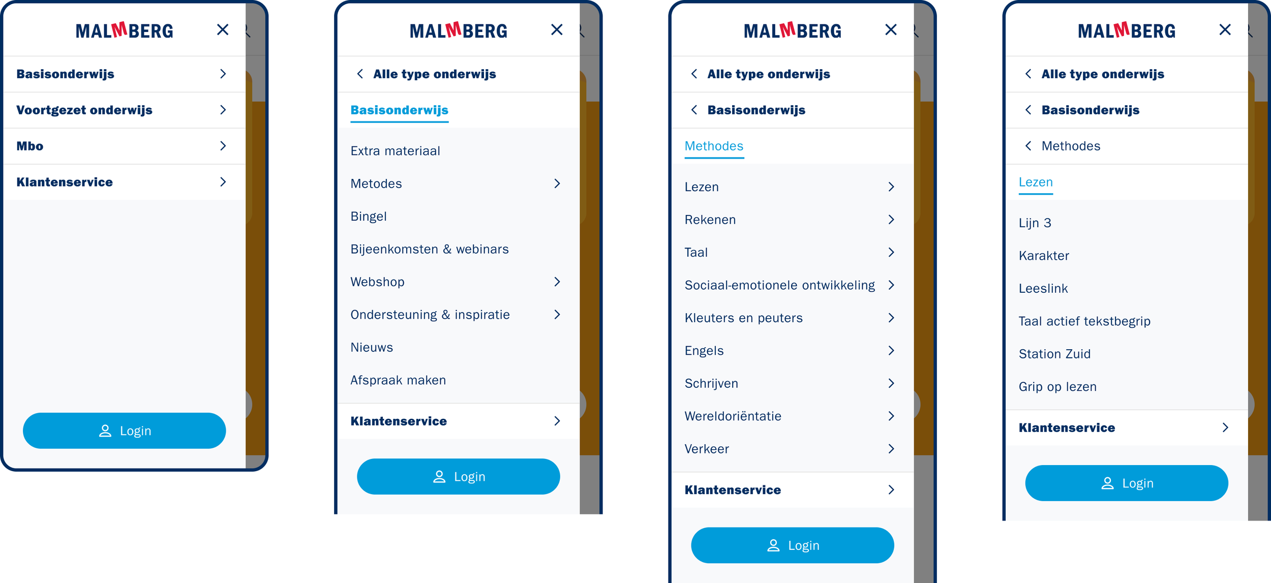
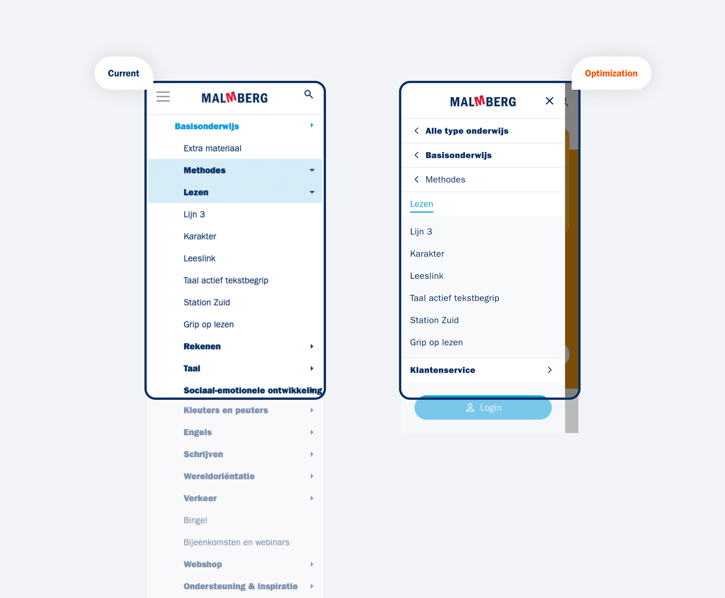
In the current situation the mobile menu keeps collapsing to such an extend that the user has to scroll a lot to see all the menu items. Next to that, there is no clear categorization of sub menu’s resulting in not knowing which items belong to which sub menu.
The optimization only shows the (sub)menu that the user has selected and allows them to navigate back to a higher level.
Quick win #2: Mobile menu
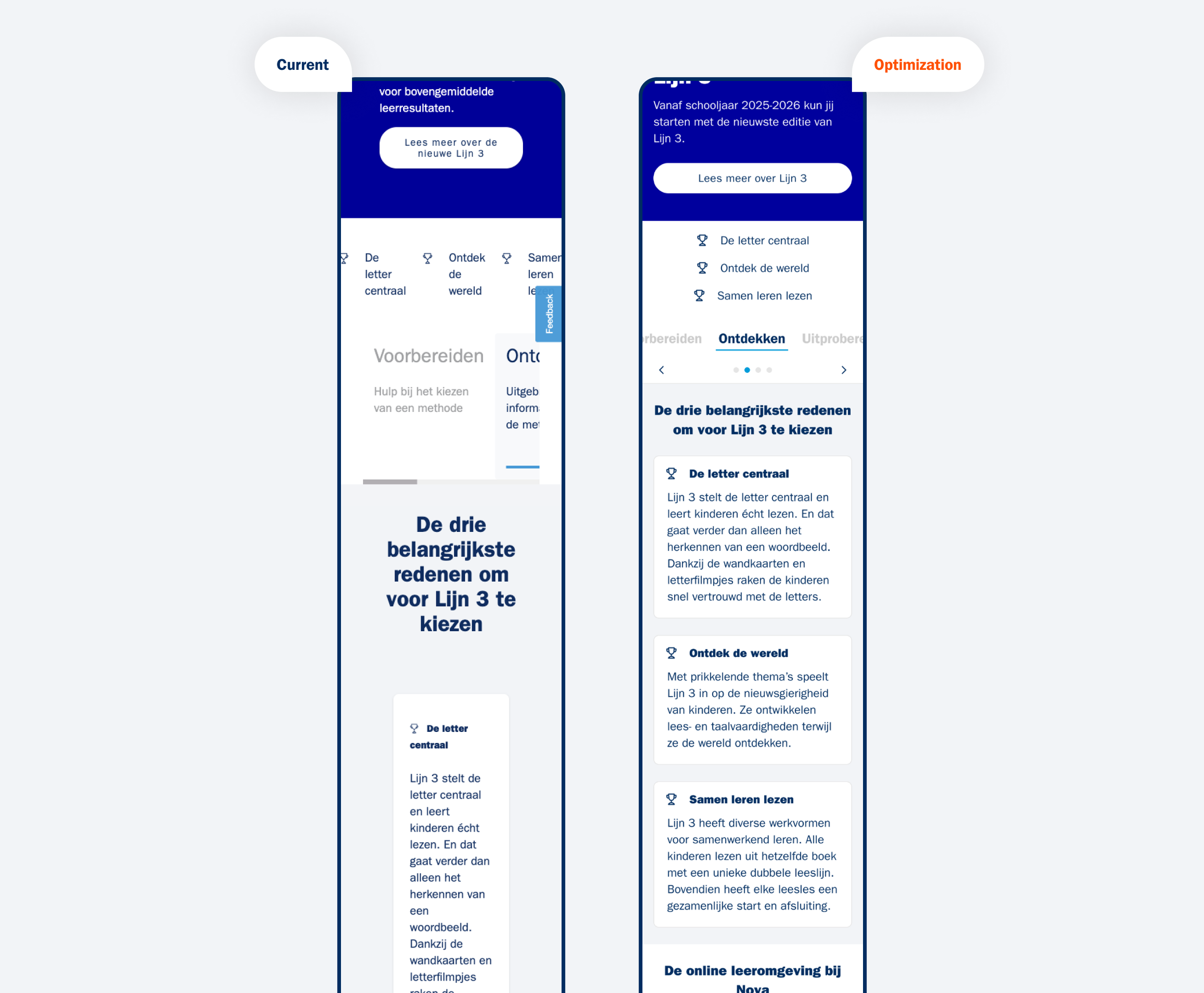
As an example, one of the method pages was optimized on recurring issues to illustrate how a better use of padding, font sizes and overall alignment has a major impact on the readability and user experience of the page.
Quick win #3: Alignment
The work was handed over in three design files (Style Library, Components and Templates) which included documentation on how to use the designs. In addition, a report was made summarizing all the design work, but also giving recommendations on future optimizations, illustrated with concrete examples/findings.
